
In the world of design and typography, the choice of fonts can make or break a project. While text fonts often get the spotlight, number fonts play an equally crucial role in ensuring a design is visually balanced and communicates effectively. Whether you’re designing a website, crafting a logo, or laying out a print publication, understanding number fonts and their nuances is essential.
In this article, we’ll dive deep into the various types of number fonts, their uses, and how to choose the right one for your project.
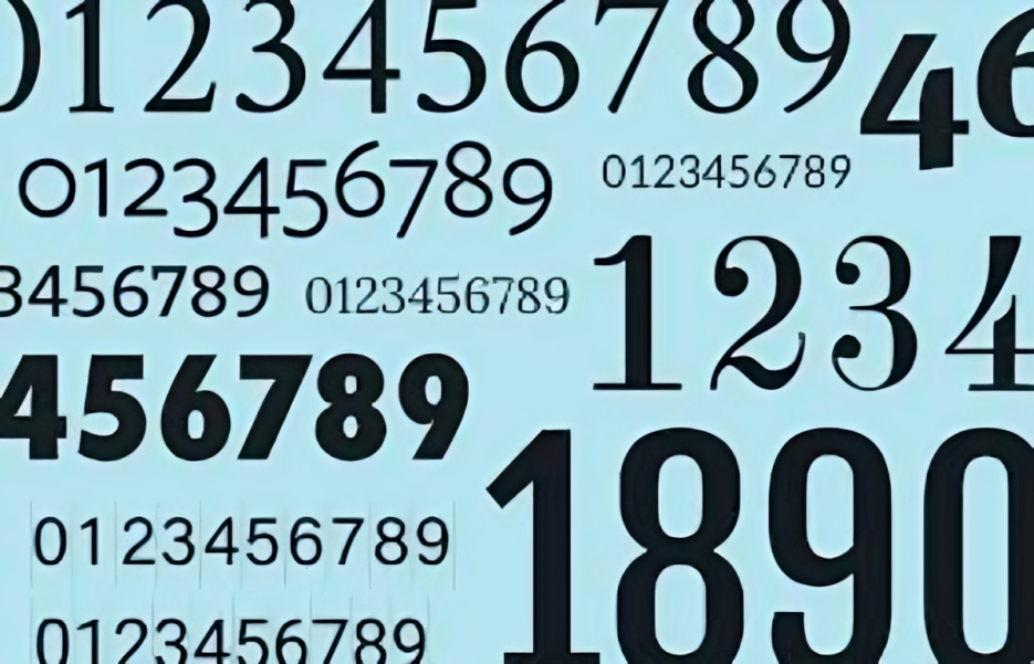
What Are Number Fonts?
Number fonts refer to the specific styles used for digits (0-9) in a typeface. Just like alphabetical fonts, number fonts can vary dramatically in appearance, from formal and traditional to modern and quirky. Designers often use number fonts in settings where digits need to stand out, such as in calendars, posters, invoices, sports jerseys, and more.
Number fonts come in a variety of styles, each evoking a different mood or message. While numbers might seem like a small part of your design, they can significantly impact the overall look and feel of your project.
Categories of Number Fonts
There are two main categories of number fonts’s: proportional and tabular. Understanding these distinctions is key when selecting the appropriate font for your design needs.
1. Proportional Number Fonts
Proportional number fonts’s, as the name suggests, are proportionally spaced. Each number is given just enough width based on its shape, meaning that narrower numbers like 1 and 7 will take up less space than wider numbers like 0 and 8. These fonts are often used in regular text settings where numbers need to blend seamlessly with letters.
Best for: Book typography, magazines, web articles, and general text layouts.
Advantages:
- Proportional numbers look more natural in running text because the varying widths match the surrounding characters.
- They create a more aesthetically pleasing and readable layout for paragraphs.
Drawbacks:
- When lining numbers up in columns (like in spreadsheets or price lists), proportional numbers can cause misalignment, making the data harder to read.
2. Tabular Number Fonts
In contrast, tabular number fonts‘s have equal spacing for every digit. No matter the number, each digit takes up the same amount of horizontal space, ensuring perfect alignment. Tabular fonts are most often used in contexts where numerical consistency and alignment are crucial.
Best for: Financial reports, spreadsheets, ledgers, invoices, time tables, and any setting where numbers need to be perfectly aligned in columns.
Advantages:
- Ideal for columns of numbers, ensuring that all digits line up perfectly for easy comparison.
- Useful in any design that requires precision, such as technical documents and forms.
Drawbacks:
- Tabular numbers can look awkward when used in flowing text, as their equal width can disrupt the natural flow of the typography.
Types of Number Fonts Based on Style
In addition to proportional and tabular fonts, number fonts’s can also be categorized based on their stylistic attributes. Here are a few key types:
1. Serif Number Fonts
Fonts are characterized by small lines or strokes regularly attached to the ends of the main strokes of each character. Serif number fonts’s have a classic and formal look, making them ideal for traditional designs.
Best for: Formal documents, certificates, books, invitations, and historical projects.
Examples of serif number fonts:
- Times New Roman
- Georgia
- Baskerville
2. Sans-Serif Number Fonts
Sans-serif fonts, as the name implies, do not have serifs. These fonts tend to look clean, modern, and minimalistic, making them perfect for contemporary designs.
Best for: Modern websites, apps, advertising, and branding.
Examples of sans-serif number fonts:
- Helvetica
- Arial
- Futura
3. Slab Serif Number Fonts
Slab serif fonts are a subset of serif fonts, but their serifs are much thicker and bolder. These fonts have a more robust and commanding presence, making them ideal for designs that need to capture attention.
Best for: Posters, billboards, logos, and branding where impact is key.
Examples of slab serif number fonts:
- Rockwell
- Courier
- Clarendon
4. Display Number Fonts
Fonts are designed to be attention-grabbing, often used in larger sizes for headlines, posters, and logos. Display number fonts can be ornate, decorative, or even experimental.
Best for: Headlines, advertisements, branding, and creative designs.
Examples of display number fonts:
- Lobster
- Impact
- Bebas Neue
Choosing the Right Number Font for Your Project
When choosing a number font for your project, there are several factors to consider:
1. Context and Purpose
What is the main function of the numbers in your design? If you’re working on a financial report or a timetable, tabular fonts are essential for ensuring that numbers align perfectly. If the numbers are part of a paragraph or general text, proportional fonts will ensure better readability.
2. Brand Identity
The font you choose should align with the brand or project’s identity. For a traditional, formal brand, serif or slab serif number fonts’s might be ideal. For a tech-forward, modern brand, sans-serif or even a display font could be more appropriate.
3. Readability
Ensure that the font you choose is legible, especially at smaller sizes. Some decorative fonts can look great at larger sizes but become difficult to read when scaled down. Always test your font at various sizes to ensure clarity.
4. Visual Consistency
If you’re using both letters and numbers in the same design, ensure that the number font matches or complements the text font. Mismatched fonts can make a design look disjointed and unprofessional.
5. Alignment Needs
If your design involves tables, columns, or lists where numbers need to align perfectly, opt for a tabular font. If alignment isn’t crucial, a proportional font may provide a more natural look.
Popular Uses of Number Fonts
Here are a few areas where number fonts’s play a starring role:
1. Posters and Advertising
Whether it’s for an event or a sale, large, bold number fonts’s are often used in posters to draw attention to dates, times, or discounts.
2. Sports Jerseys
Each player’s number on a jersey is a key element of their identity. Sports teams often choose distinct number fonts that match their branding and logo styles.
3. Clocks and Timers
In digital and analog clocks, number fonts’s are crucial. Legibility is key, but the font also plays a role in the overall design aesthetic of the device.
4. Calendars
Dates on calendars need to be clear and readable, but they also need to fit with the overall design style of the calendar, whether it’s minimalistic, playful, or traditional.
Conclusion
Number fonts may seem like a small detail, but they can significantly impact the overall effectiveness of a design. Whether you’re looking for a formal serif number font, a modern sans-serif option, or a bold display font for your next project, understanding the different categories and styles of number fonts’s is crucial.
Always consider the context, alignment needs, and brand identity when choosing the right font. With the right number font, your design will not only look more polished but also communicate its message more effectively.